Client
Off the Rails Brewing Co.
Services
Brand development, logo design,
and packaging design
Year
2022
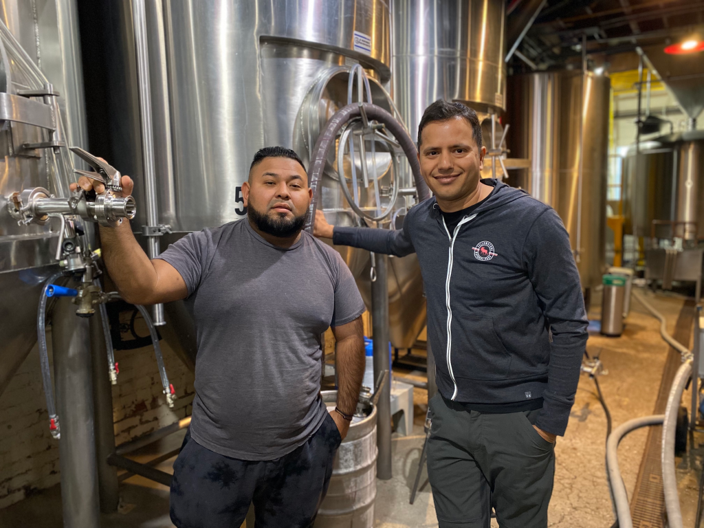
Off the Rails Brewing Co. is a micro-brewery in Sunnyvale, California. Run by an enthusiastic and hands-on Indian engineer, the brewery is a hit amongst locals (did we tell you that these locals are mostly Silicon Valley chaps?).
Like many other businesses that have already found a foothold, they had a problem – the lack of clarity on who they exactly were, who they were for, and how to get that message across.
Plus, having gained enough critical mass, their next major league move was to release their craft brews for retail & OTC sales (in cans).
Retail – where you compete with countless other brands for your customers’ consideration.
To get them retail-ready, we worked on repositioning the brand to get a clear & effective brand messaging, and extending that into the packaging for cans.
Stage 1 – Understanding the Market & the Competition
This involved an in-depth analysis of the Craft Beer category, the audiences it attracts, their pain points, motivations, and challenges, and the competitive landscape.
For those who don’t know, SoCal (Southern California) has great & famous breweries… To be fair, quite a few. And many of them tend to have their beers already being canned and sold OTC or in retail. So, the competition was stiff.
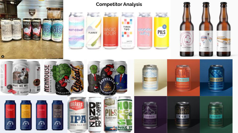
Basis our findings, we concluded that most breweries played on –
- A high degree of experimentation in their brews
- Quality (which, by the way, is a highly subjective parameter)
- Sub-cultures & vibes – ranging from psychedelic to retro, all the way to very traditional & old-school
- Simplicity & being straight-forward
Our job was, therefore, to find the moat that Off the Rails would be known for.
Stage 2 – Digging What Off the Rails Was All About
Saurabh, the founder of Off the Rails, is an Indian Engineer who converted his passion for brewing beers into a micro-brewery & kitchen (take note – this info will come in handy later). The tenets on which he preferred to run his brewery were –
- A knack for experimentation, though within reason & as per what consumers sought
- Focus on using locally-sourced ingredients
- Humanistic practices (going out of the way to make human experiences better)
- Delivering a wholesome experience – remember the kitchen? OTR is one of the very few breweries that have their own kitchen operations in SoCal.
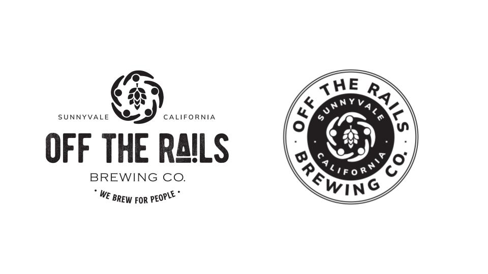
This led us to the messaging that summed up everything the folks at Off the Rails Brewing stood for – We Brew For People. And the iconic logo, which shows a hop (the core of beers) surrounded by people.
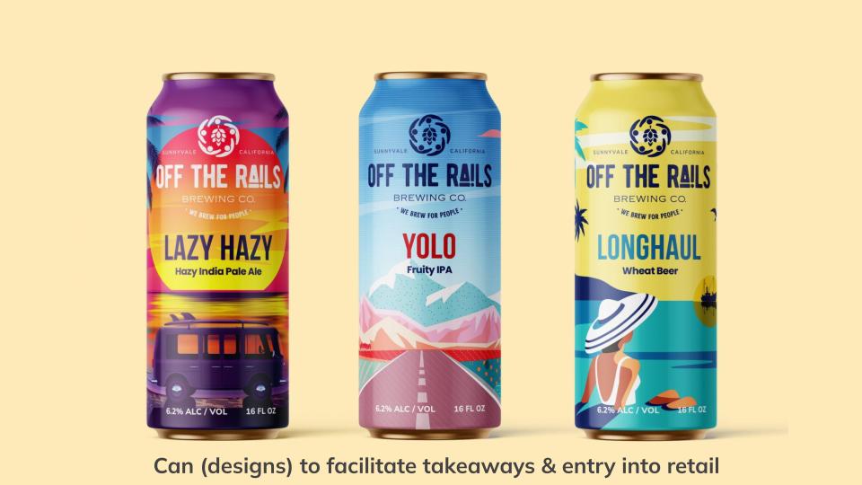
Stage 3 – Translating That into Packaging
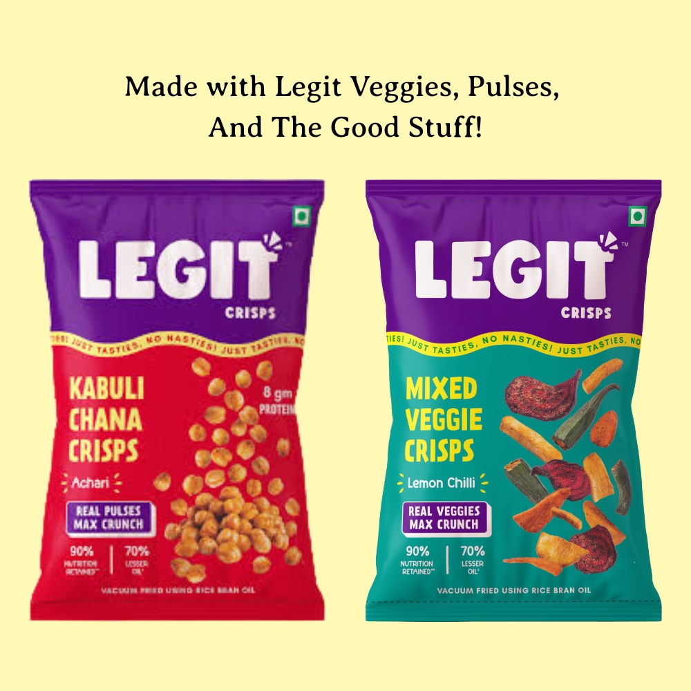
As part of the mandate, we were tasked with developing the packaging for 3 of their top selling beers which would be canned –
- Longhaul – Wheat Beer
- Yolo – Fruity IPA
- Lazy Hazy – Hazy Indian Pale Ale
We slowly peeled back the layers on what each beer represented, the kind of experience a customer could expect from it, and the vibe they gave off.
And very importantly, we focused on using illustration-focused designs which are known to work in the market Off the Rails would be competing in. Accordingly, the emotions & nature of the brews were extended to the relevant packaging designs.
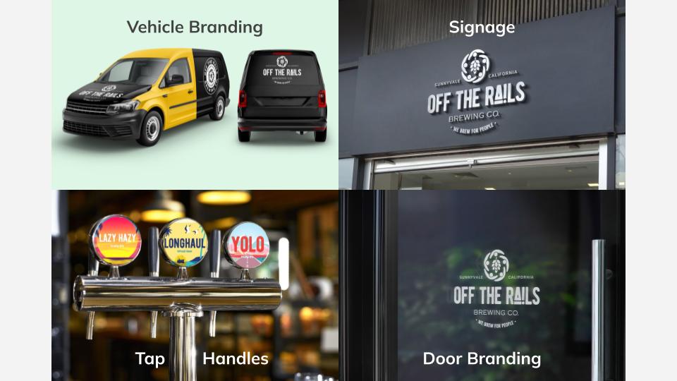
Stage 4 – Extending the Identity Across the Board
From signage outside the brewery & prints on the door, to tap handles, coasters, and glasses, a brewery puts itself out there every day in many forms. And we made sure the Off the Rails identity resounded loud & clear everywhere.