Client
LegitFoods LLP
Services
Market Research, Rebranding Development, Packaging Design, and Creative Services
Year
2025
Healthier snacking as a category is booming in India. Every customer imagines that every chip is a silver bullet that can cure their cholesterol yet be tasty as well. And of course, there are brands that promise to do just that, yet deliver weird-tasting snacks.
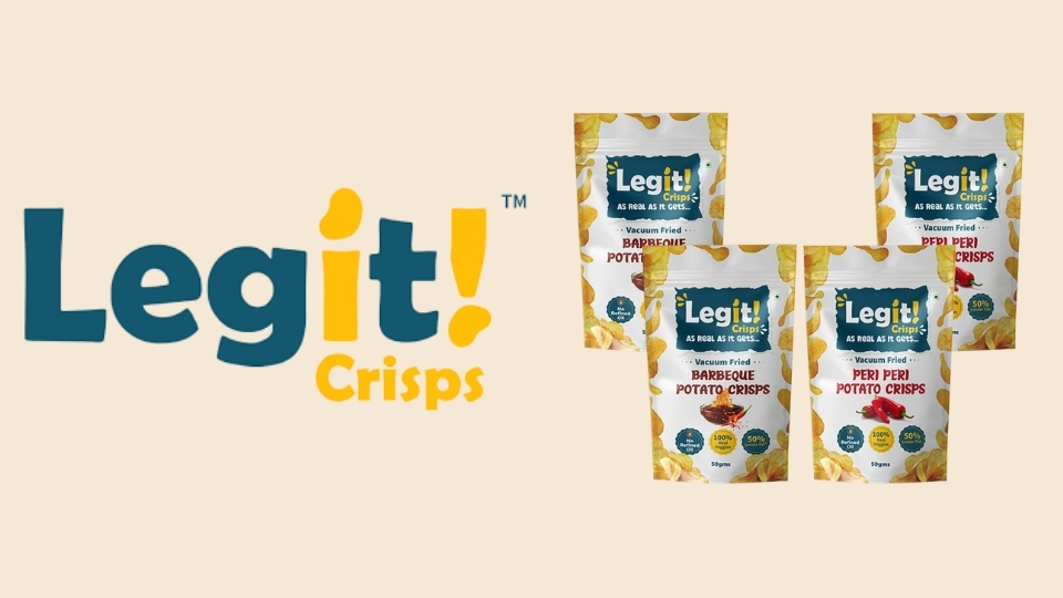
Legit Crisps, founded by Amrutha Ravindran does things different.
Amrutha, a techie mother with a stellar career in software industry, started Legit because she figured that any snack available in market is either convenient and tasty, or better for you. There’s no balance.
So, she combined vaccuum frying (uses 70% lesser oil than traditional deep frying) and actual seasoned veggies to make snacks that people could eat without feeling guilt… like, really!
However, after initial market feedback, they identified certain gaps in their branding & packaging that they wanted to address, namely –
- It doesn’t stand-out on the shelf
- Perception that it’s a kids focused brand
- Legibility challenges with the logo
Our Approach – Understanding the Context
We first performed a diagnostic check with the founding team of Legit to understand –
- Who has been purchasing their products so far and why?
- What’s been the most common and isolated feedbacks, positive/negative?
- What kind of a product differentiation have we been able to create, if any?
- Insights as to why people have been choosing these products instead of the competitors
- Importantly, why the need for this rebranding exercise – what hasn’t worked so far?
That, backed with an in-depth analysis of the category, the audiences it caters to, their pain points, motivations, and challenges, helped us get a better sense of who we are designing for, what do they care about, and what’s the best way to get through to them.
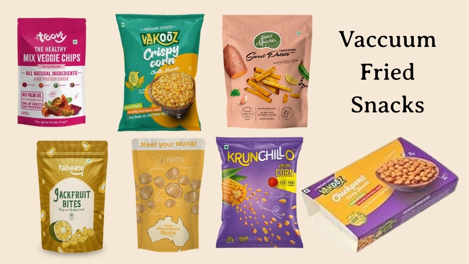
For the competitive landscape, we looked at both their direct competitors in Vaccuum Fried Snacks sub-category, and in adjacent sub-categories such as roasted, baked, and other formats of snacks.
Our Findings
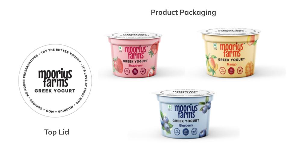
Basis our findings, we were able to corroborate certain learnings we previously had picked while working on projects such as No-Bullsh*t Snacks, Moorius Farms, and 3Sisters Sports Drink –
- Customers base their purchase/trial decisions on an order of factors – Taste > Health Benefits (if any) > Features ~ Price
- Therefore, we had to ensure that the packaging conveys the sheer experience of eating (driven by great taste) more than just leaning on health claims.
Our Design Direction
To capture the excitement and intrigue of customers, without making the product feel dull, medicinal, or very health-oriented-yet-doesn’t-taste-good, we ensured the typography, colour, and elemental representation captured the right vibe.
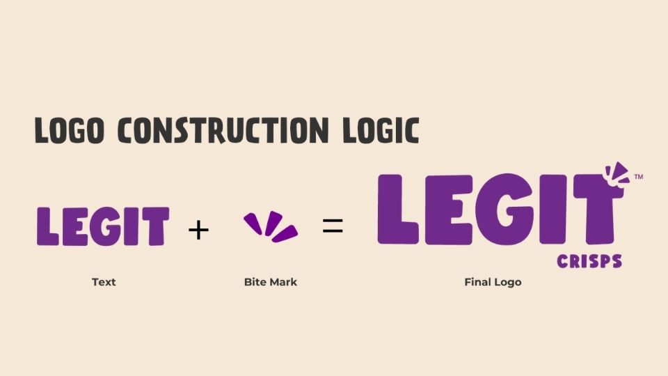
Cracking the Logo
We fundamental alignment on colours, tonality, and the vibe we wanted to capture, we moved forward to creating a logo unit that would capture the excitement of the food brand, without appearing clinical, and would ensure that the pitfalls of the original logos are addressed.
That’s how we eventually finalized this logo, tested for extension across placements and platforms as well.
Packaging Design
Keeping in mind the previous challenges of the packaging appearing undifferentiated, not standing out on the shelf, and being a little all over the place, we laid down tenets to drive the new design –
- It must clearly convey the brand name
- It must feel exciting and non-boring
- It must convey the most important things – what’s in it, the flavour, and benefits clearly
- It must stand out on the shelf, and that too in a good way
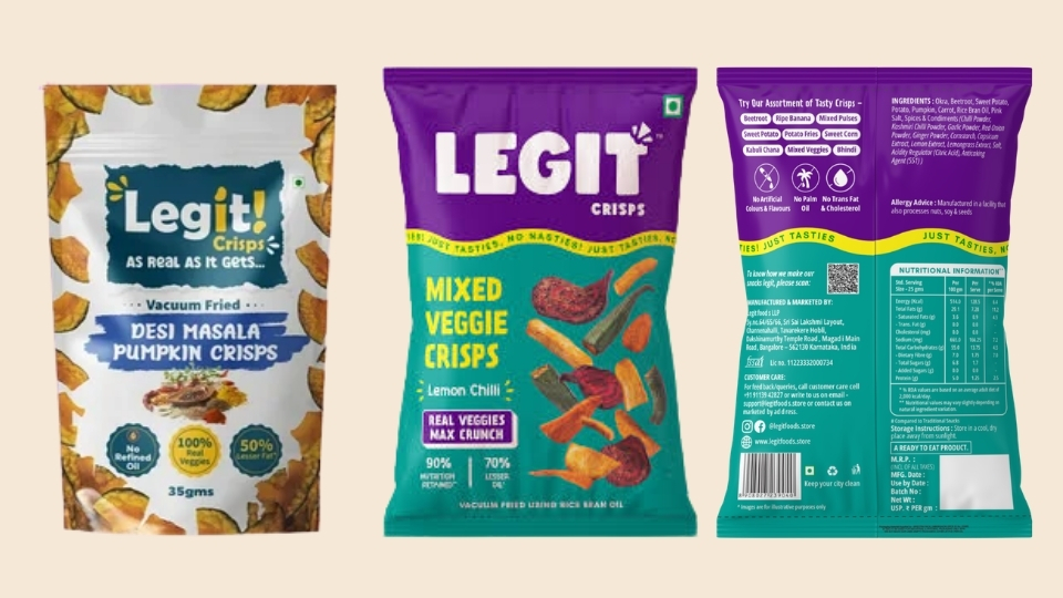
Here’s the comparison of the old and the new packaging, placed side by side.
Once the base structure was locked, we ensured extensibility by extending the range to the complete 9 SKUs, across sizes.

The Job Isn’t Over – Making them Marketing Ready
To give their marketing and sales teams a head start from day 1 after the brand & packaging refresh, we prepared an extensive brand book that covers –
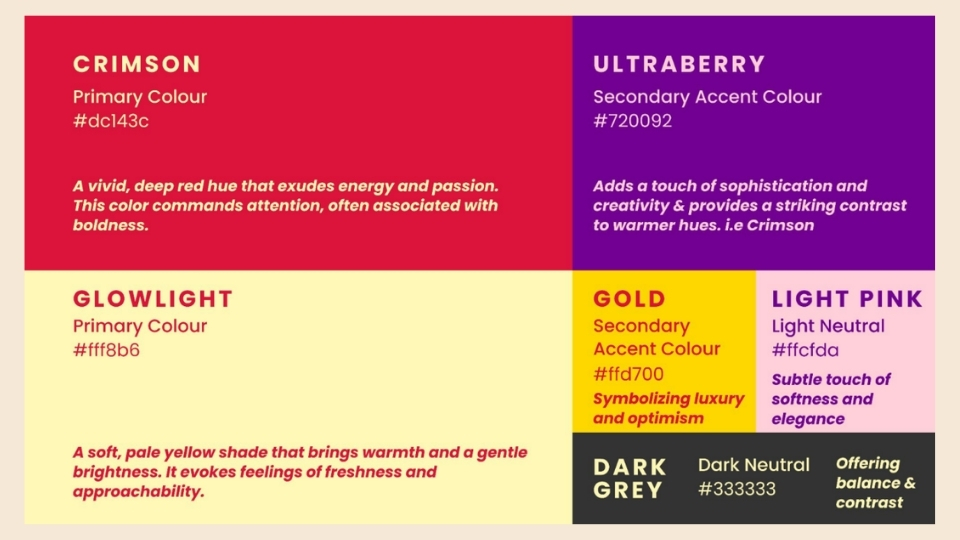
- Typography
- Colours
- Dos and Don’ts
- Logo Applications
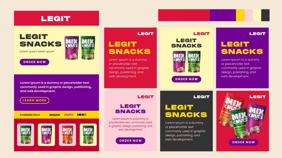
- Digital & Print Extension Examples
Further, to assist the sales teams, we prepared brochures, tent cards, and standees to help them stand out while doing sampling and sales activities.

What More Do We Help Them With?
Legit & Amrutha are still in their nascent stages and this is when a committed and synchronized team helps avoid pitfalls, time and capital wastage, and enables them to cover ground faster.
Currently, we help them with basic marketing & partnerships consulting, along with creative support.
Make Legit Growth For Your Start-up
At Greek Alphabet Media, we’re backed by 6+ years of experience in branding & marketing for FMCG & D2C brands, with specialisation in categories that humans interact and consume daily, such as beverages, coffee, and snacks. If you’re looking to launch a new brand or take your existing brand to the next level, get in touch.