Client
Bombay Island Coffee Co.
Services
Marketing & Communications, Creative & Packaging Design
Year
2021 – Present
Team In-Charge
Priyansha Anand, Bhargavi Divate, Raghav Upmanyu
The third wave of artisanal coffee started in India around 2015, when consumers started subscribing to the value of carefully crafted coffee experiences. One of the amazing brands that this wave brought to the world is Bombay Island Coffee Co.
Started by Rupal and Vineet Jain, two avid coffee lovers and CAs, Bombay Island is an interesting story about how people with no legacy knowledge or backing in a category ended up making their mark in the world of coffee.
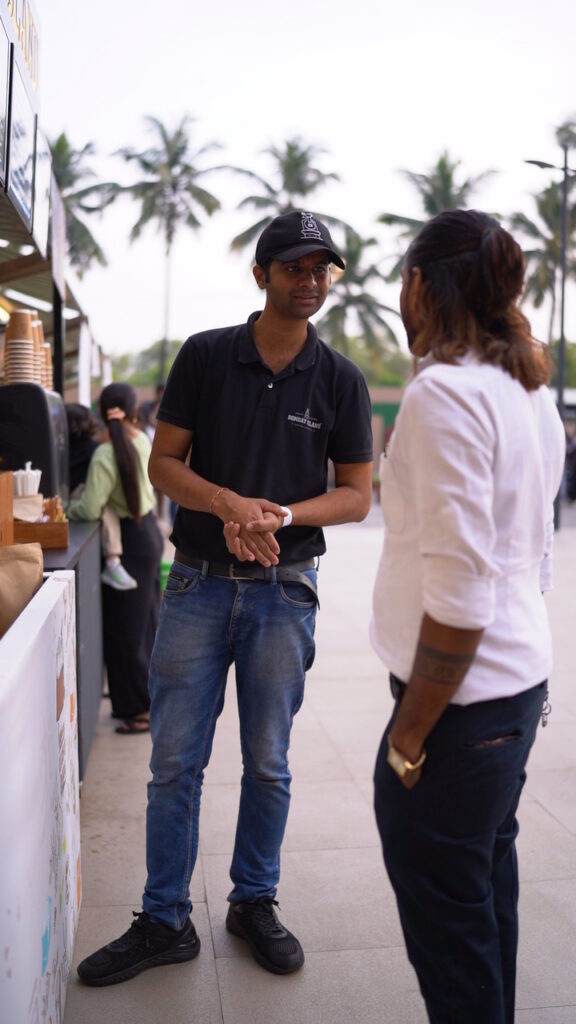
Started of from a humble hall-in-the-wall kind of coffee roastery in Malad W (Mumbai), they’ve so far expanded to 2 beautiful stores in Vikhroli (E) and BKC, delighted coffee lovers across events, and continue to enchant people every day with home-delivery of their coffee beans.
However, founder-led brands often face one difficulty – their branding tends to start off as a figment of their intuition and needs to be structured logically post facto.
We got the privilege to do that with them and translate it into delightful experiences for consumers.
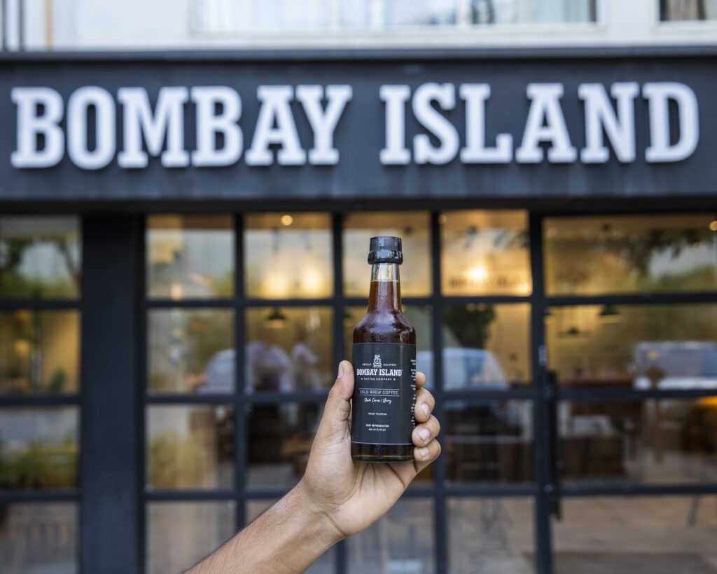
Problem Statement
- While some of the brand assets had been created previously, such as the brand colours (typical ones used for coffee) & typefaces, there was a limited sense of how they could actually be used.
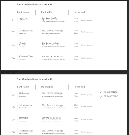
- The use of assets like illustrations and typefaces (there were 8) was often intuitive (what looks good) instead of what makes sense. This resulted in distinct looking collaterals, all carrying the Bombay Island logo, floating around.
- While the founders had some semblance of what their brand stood for, there was a resource & time limitation to test it in spheres such as digital communications, consumer interactions, etc., document it, and standardize it.
Our Action Plan
While our mandate was to handle social media marketing for them, we identified these issues early on, and made suggestions about undertaking this this realignment of the branding. Over the next few months, this is what we did –
- Studied the competitive landscape of artisanal coffee, dominated by giants like Blue Tokai, Third Wave, KC Roasters, and with soon to be significant players like Subko, Nandan Coffee, etc. We took a deep dive into their individual branding & how it translates into aspects like packaging, cafe experiences, etc.
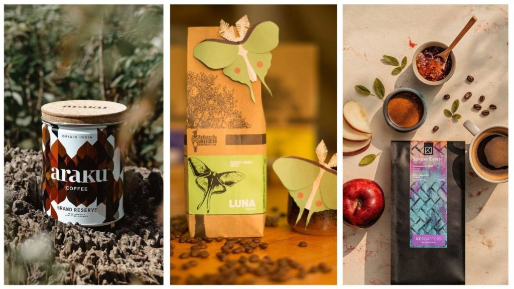
- Based on months of studying Bombay Island, we understood a couple of important things –
- Their inclination is towards sustainable & careful growth, not “growing at all costs”.
- They are deeply consumer-focused. Founders took the personal efforts to check in with individual customers & drive resolution for their issues. This extended even to their internal teams, resulting in low churn.
- There’s a deep respect towards keeping a tight feedback and quality check loop. This resulted in more work, but happy consumers who’ve stuck with the brand since inception, thanks to consistency in their products.
- A deep sense of hospitality & generosity. From surprising guests on their birthdays to staff training for warmth, and ensuring portions sizes make consumers feel comfortable… they’ve done it all.
- It’s common for founders to have stories about consumers. It’s uncommon for consumers to have stories about their favourite brands. The latter was true in the case of Bombay Island, with consumers sharing stories of comfort, affection, and support towards the brand.
- Artisanal coffee, like other artisanal categories, tends to bring a sense of snobbery, not just in consumers, but also brands. In their experience with other brands, Rupal & Vineet identified that snobbery tends to alienate consumers who are just trying out artisanal coffee for the first time. Therefore, they made it a point for Bombay Island to be the champion of both the coffee aficionados and the new explorers.
- Form theses, test, and move forward – As the brand was continuously growing, there was no chance for us to simply pause other things while we sat and figured out the branding. So, we compiled all the inputs, created our brand elements based on values derived from actual practices, and tested it out across different collaterals.
Testing, Testing… 1, 2, Coffee.
We pieced together the information gathered about Bombay Island, through consumer surveys, founder interviews, and from our interactions. The major value system for Bombay Island was built around –
- Building for humans, to deliver kind and generous experiences
- Approachability
- Calm confidence in its own capability, but never leaning on snobbery
- Product excellence – we keep iterating till we get it right
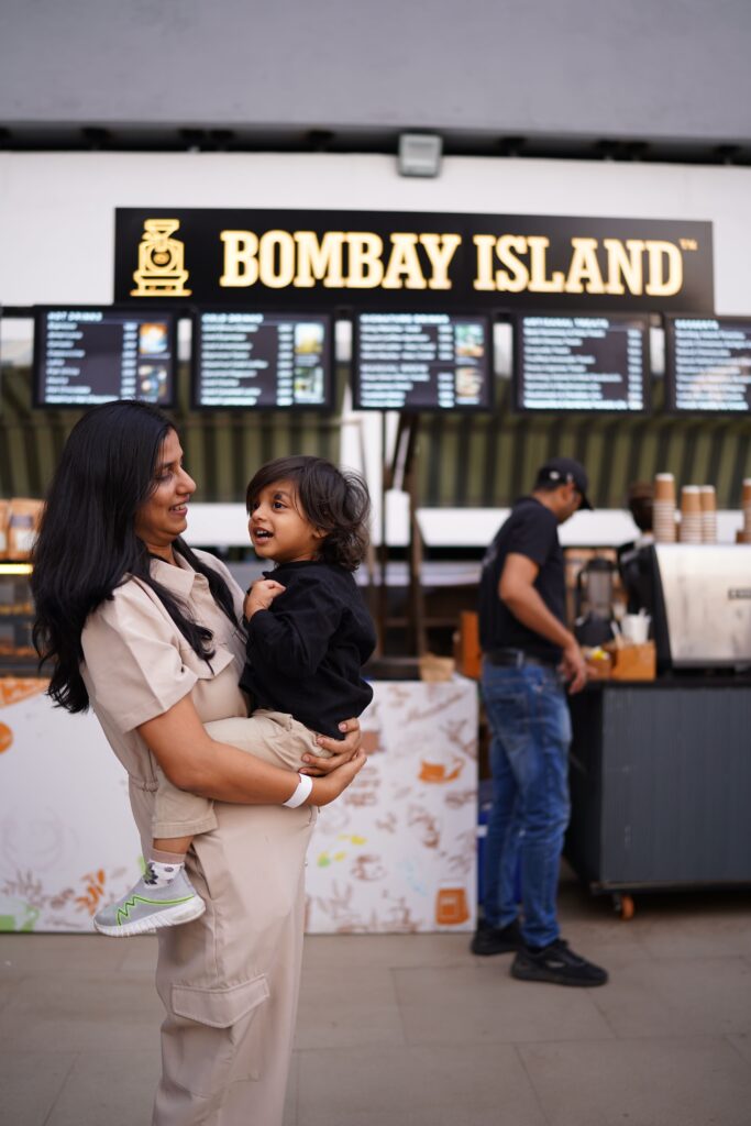
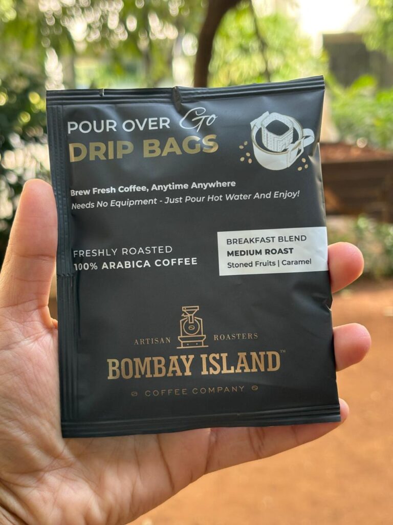
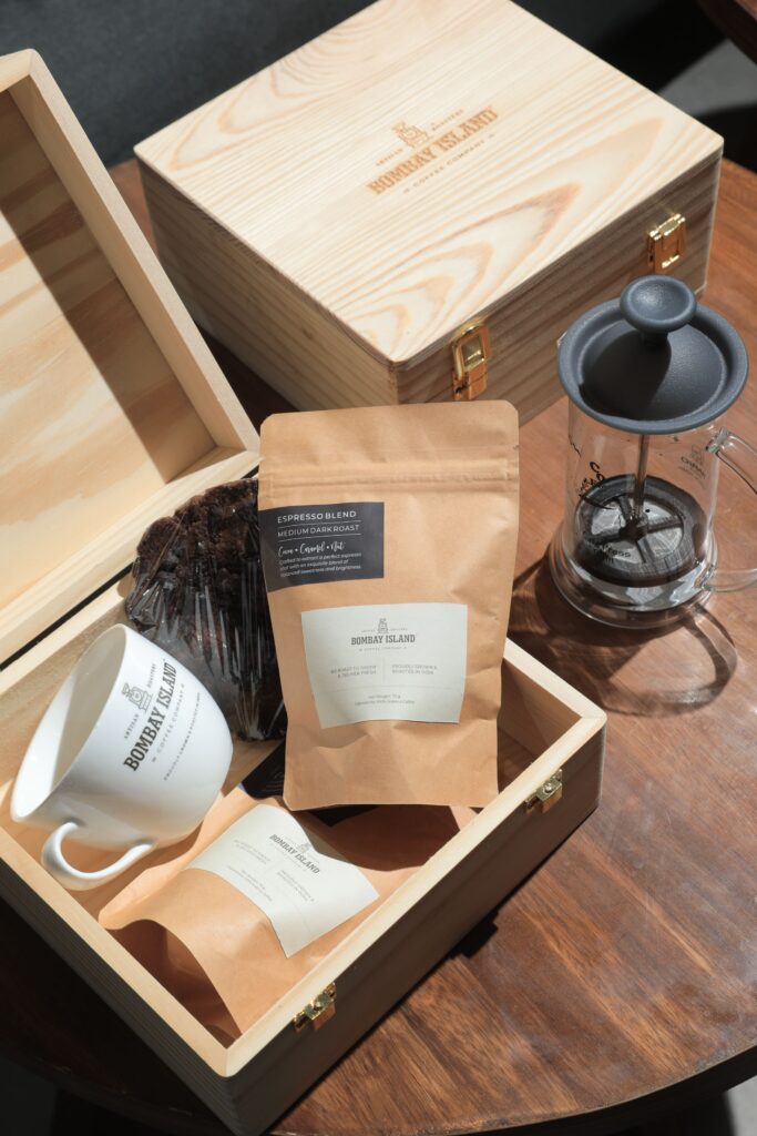
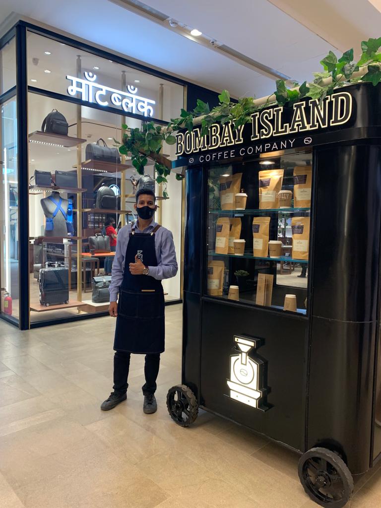
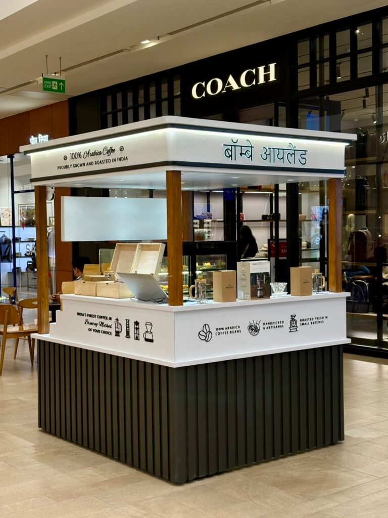
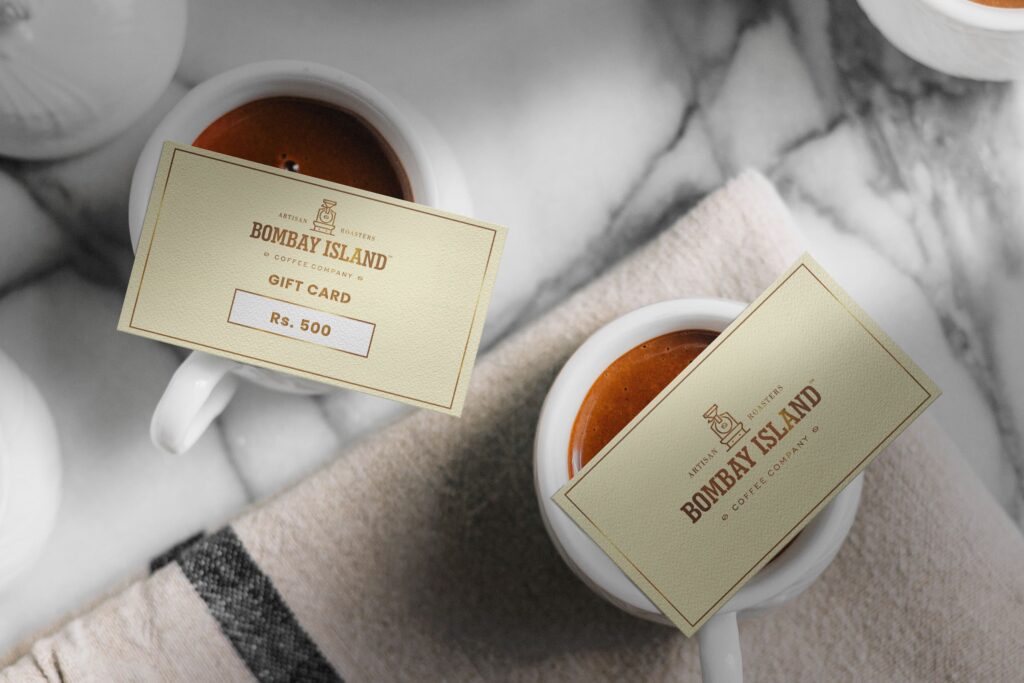
We transformed our thesis into different brand elements, such as a streamlined set of typefaces, brand colours, communication guidelines, visual styling, and more. While the same can’t be laid out here, we now continue to use them across different mediums, such as packaging, cart designs, cup sleeves, photography, and more. And even today, Bombay Island continues to iterate & get better.
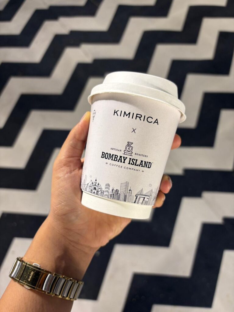
We’re proud to be a part of Bombay Island, and look forward to growing the brand further. 🙂
If you’d like a partner that operates as your Marketing Co-founder, get in touch.

